
get in touch
with
Thank you for reaching out!
We'll be in touch.
About the project
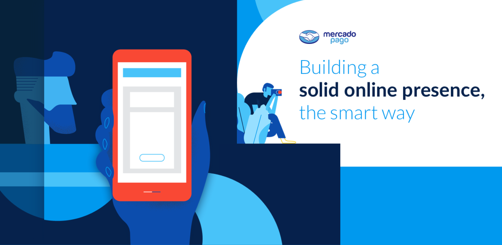
Mercado Pago, the leading online payment solution in Latin America with over 100 millon registered users, approached DHNN seeking to reinforce their site's presence and communication.
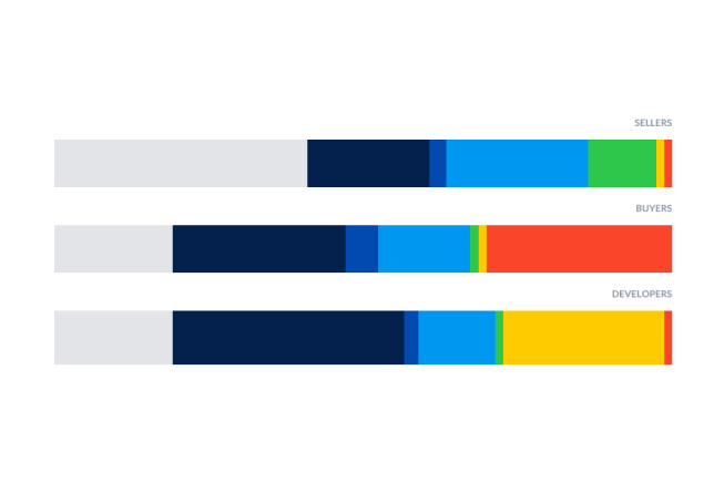
We needed to understand Mercado Pago's main audience
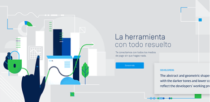
DEVELOPERS
The nucleus that sets the ecosystem in motion by facilitating transactions between sellers and buyers.
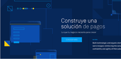
SELLERS
MercadoPago's visible face, in charge of expanding the brand's universe through new business opportunities.
BUYERS
The circuit's final phase, the ones that will literally 'seal the deal' and the site's most important target.
Keywords
UX Research
User Experience
Product Design

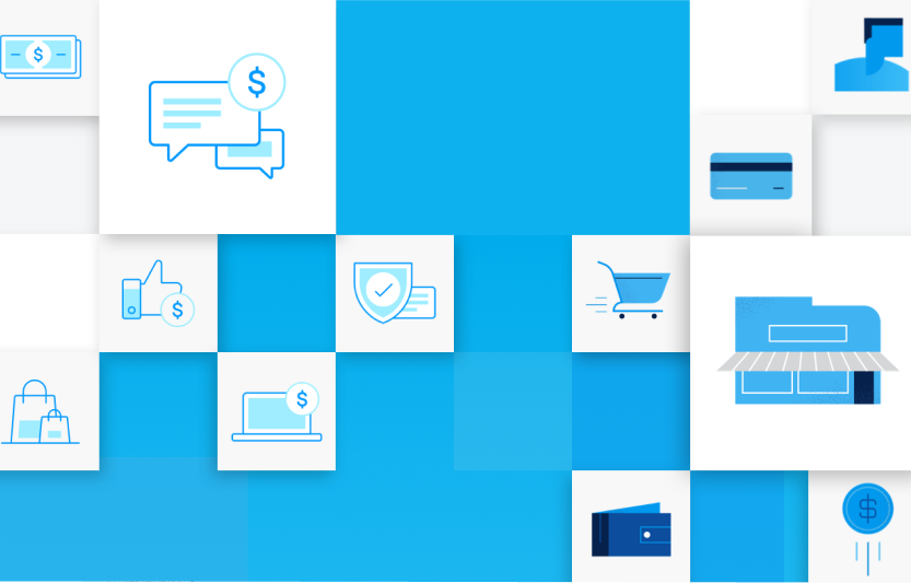
Iconography
Line icons were created, portraying the idea of versatility and dynamism present in Mercado Pago. Moreover, the clarity and simplicity of linear vectors transmit professionalism and expertise. Meant to highlight the site's content. Less data-oriented and more of the aspirational type instead to get closer to the users.
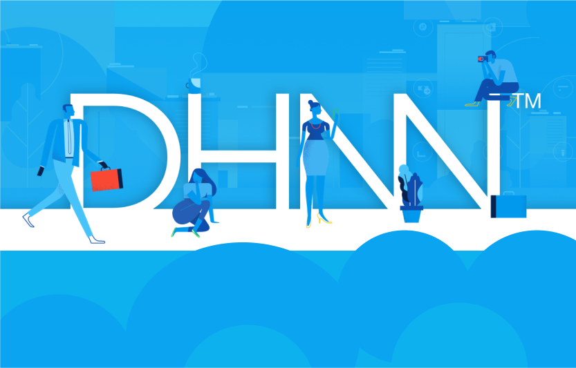
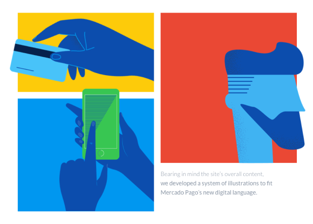
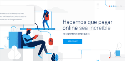
Illustrations & Color palette
We played with different ideas to get our final set of illustrations of objets, characters and gestures. Based on all three categories, we developed different chromatic palettes to represent each group, making it easier for users to differentiate one party from another.
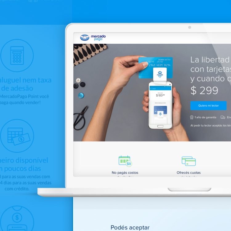
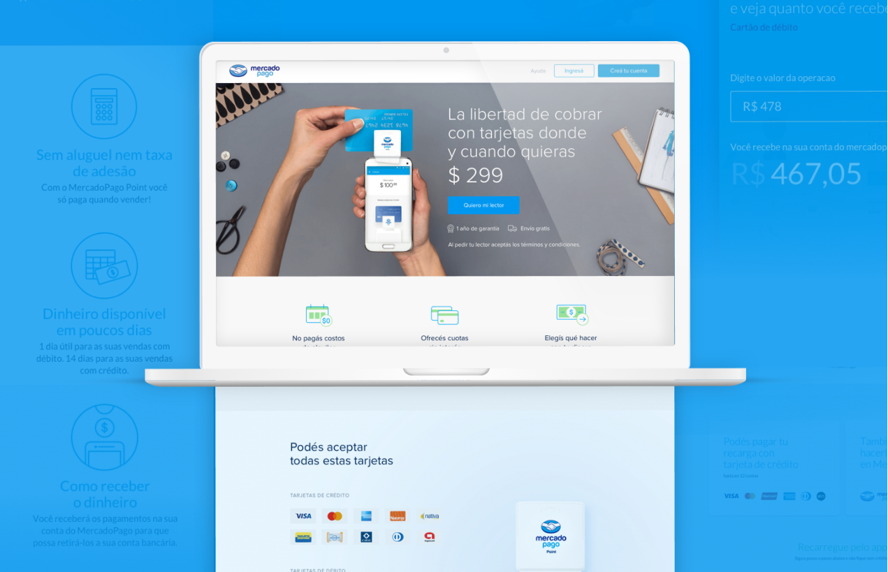
Landing page
A new landing page was made, prioritizing the content of persuasive nature over the more technical and descriptive, making the whole navigation experience easier, enjoyable and effective.
Improvements
Bringing real people together through a whole new digital experience.
Throughout this extended project, DHNN managed to build a cleaner, visually attractive and easy-to-navigate series of elements from scratch for both desktop and mobile, enhancing Mercado Pago's identity, all the while fortifying the platform's online presence for all three audiences: developers, sellers and buyers.

View more
Obviously, this website uses cookies.
view policy